S1L Atoms
Buttons, Forms, and Icons
These are the smallest elements that a website uses to create a final page. Below we will show the builds for the Atoms that will be used on the Synergy One Lending Rebuild site.
Piece by Piece
From the smallest element of the website, S1L.com will have an intricate level of detail that will seperate this mortgage lender, from all other mortgage lenders.
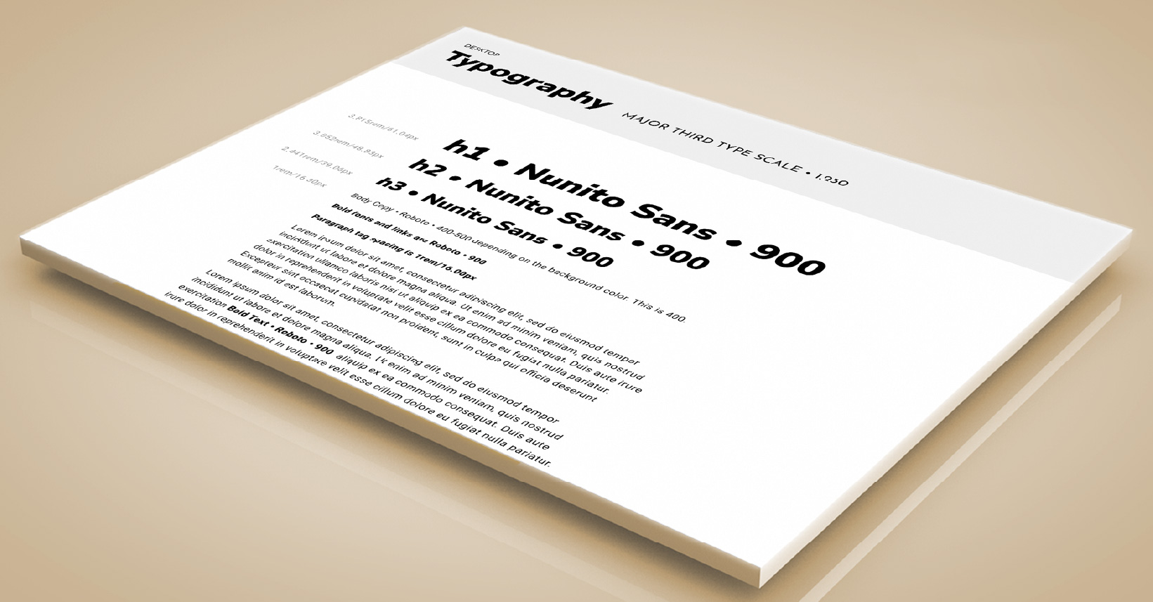
Atom:
Typography
Due to Typography being such a large multipart and complicated topic, we’ve given it a unique page. All details are at the link below.
Atom:
Brand Buttons
Button design is a very important piece in establishing a website brand identity and a clear and simple call to user action. See in detail how we’ve designed the buttons with the link below.
Atom:
Brand Forms
Creating simple and clear forms is the best way to get our clients information, and deliver them a loan! Trying and measuring new techniques with the layout will help us deliver better results in our user experience.
Atom:
Brand Icons
Creating simple and clear forms is the best way to get our clients information, and deliver them a loan! Trying and measuring new techniques with the layout will help us deliver better results in our user experience.
Atom:
Brand Lists
Visibility of the topic in a short, punctual list can clarify all topics in a matter of seconds. Time is of essence for all users, and a well designed list quickly guides a user to conversion. Click on the link below to see in detail.
Forms of Ease
Helping The User by making it easy to give their info
Making it complicated or difficult to fill a form will have many users dop off of a site. Simple, short forms have been proven to increase conversion. With a well branded form, we can help our users easily get their loan, from start to finish.
S1L Brand Forms
Forms are generally not a very enjoyable experience for a user. Therefore all forms should be extremely easy to use, and even easier to understand. The less fields to fill, the more likely the form will be filled.
The form fields have been given a clean minimal styling, with S1L branded colors when in focus. The subtle shadow on the fields vanishes when the field is in focus, as well as the borders changing to our S1L Yellow.
Compliance requires all forms have a disclaimer posted next to them, therefore when the form is hovered over at any point, a tooltip will popup below the form. This eleiminates the messy appearance that a long disclaimer would give on the page.
Simple and Elegant
Having the form designed with modern minimalism and elegance gives the user a sense of trust. All the forms are branded with our form fill valid and invalid colors. For example, filling in the email field with a proper email will give the blue
Multi Step Form
If need to have a lot of fields for whatever reason, splitting the form into multiple steps has been tested and proven to create higher conversion.
These forms work well because they provide the illusion of a shorter form, making the process seem less demanding and time-consuming. This is an instant boost to user experience, and it is also a smart way to reduce form abandonment.
Give It A Push
Helping The User by making it easy to give their info
These are the smallest elements that a website uses to create a final page. Below we will show the builds for the Atoms that will be used on the Synergy One Lending Rebuild site.
S1L Brand Buttons
We’ve designed the buttons to have 3 different shape styles: Rounded Corners, Square Corners, and Circular Corners as well as 3 different size scales: Small, Medium, and Large.
The buttons have been designed to be very visible against any shade of background color. We’ve used a thin 1px White border for dark backgrounds or a 1px Black border for light backgrounds. This will add an increased contrast ratio, and give the button an extra pop on the screen. The hover micro-interaction gives a comforting and gentle push forward that makes the user feel like he’s moving ahead.
All the buttons are responsive, meaning the size gets smaller depending on the device being used. There are Large sizes for Widescreen, Medium size for Desktop Tablet Extra and Tablet, and finally a small size for mobile.
Small Buttons
These are smaller buttons that will not stand out as much as larger buttons. They have a 2 word maximum. These are generally used for multiple button sections, or less important links. They scale to 3 different responsive device sizes, that always have a ‘Small’ sized feel to them.
Small Sized Primary, Secondary, and Tertiary Options
The Orange Button
is the Primary CTA
Medium Buttons
These are the standard medium sized buttons. They will be the most common buttons used site wide. These scale to 3 different responsive device sizes, that always have a ‘Normal’ sized feel to them.
Medium Sized Primary, Secondary, and Tertiary Options
The Orange Button
is the Primary CTA
Medium Sized Primary, Secondary, and Tertiary Options
The Orange Button
is the Primary CTA
Large Buttons
These are smaller buttons that will not stand out as much as larger buttons. These are generally used for extra important links. They scale to 3 different responsive device sizes, that always have a ‘Huge’ sized feel to them.
Large Sized Primary, Secondary, and Tertiary Options
The Orange Button
is the Primary CTA
Lists
We will follow a few simple rules to get the best results for our lists, as well as our users. The purpose of a list is to get a short point across to a user, with only a quick glance. The shorter the bullets, the shorter the text, the quicker the conversion. People do not have time for ‘extra’ unnecessary adjectives and details.
Number Lists
-
Goto s1l.com
-
Fill out a form
-
Talk to our loan officer
-
Get your loan
Bullet Lists
-
Simple, fast loans
-
The interest rates finally dropped
-
Close the loan quick
-
We've got Jumbo Loans too
Need Some
Loan Help?No problem! Send us a message about what you’re looking for and we’ll get right back to help you get through your dream loan!
Synergy One Lending, Inc. ©2026
NMLS #1907235CORPORATE HQ:
610 W. Ash Street, Suite 1505
San Diego, CA 92101
(888) 995-1256Synergy One Lending, Inc., NMLS 1907235 | www.nmlsconsumeraccess.org | 610 W. Ash Street, Suite 1505, San Diego, CA 92101 | (888) 995-1256 | State required licensing information for S1L: AZ BK #1006787; Licensed by the Department of Financial Protection and Innovation under the California Residential Mortgage Act and the California Financing Law license; GA Residential Mortgage Licensee #70829; KS Mortgage Company License #MC.0025627 and KS Supervised Loan License #SL.0026885; MA Mortgage Lender/Broker License #MC1907235; NV Mortgage Company License #5186; Licensed by the N.J. Department of Banking and Insurance; OH Registration #RM.804609.000; Rhode Island Licensed Lender and Broker.
* By entering your information and clicking “Get My Results”, “Submit”, “Let’s Get Started”, or “Apply Now” you are authorizing Synergy One Lending to contact you, using the information you provided above. We may call, email or text you and Message and Data Rates may apply. You can STOP messaging by sending STOP and get more help by sending HELP. We may use automated dialing systems, prerecorded voice messaging and AI (Artificial Intelligence) Assist in connection with calls or texts. This permission applies even if you are on a company, state or national Do Not Call Registry. You may opt-out of receiving these communications at any time. This consent is not requirement to obtain a loan. You may choose not to submit and contact us directly by our phone number listed. Our commitment to privacy can be found in our Privacy Policy. Click here to see our Terms of Use. To review your Opt-Out options Click here.
